Monday, 3 November 2014

Dry Point

In today's session we tried out the technique of dry point which entailed us to scratch onto a aluminium surface with a burin that acts like a pencil which acts as a plate for the ink print, and then rubbed with ink of any colour depending on the image in question with any excess rubbed off with it. Finally the plate and a piece of paper are fed into a press where the ink on the plate is compressed onto the paper where the print is made.


Here is my first scratched plate that was damaged in the top half by a unprepared press which I wasn't supposed to use so I had to cut it off making a press that is both incomplete and half the size. Besides my foolishness in trying printing without proper skills, the print that came from this plate was quite nice, although it was a bit bare and the shading didn't really work, but as a first try at the dry point medium the image that came out was not too bad. I would address the problems in this one with my next printing plate.


The next print I made was based upon the head of the key chain I used for the study. I added more shadow and cross-hatching this time to create better contrast and more dimensions through the added tone. I think the plate and print of this original drawing was quite good as it really captured the feel of the object more then the last one. However there is way too much negative space in the image that it becomes sort of distracting and I feel the cross-hatching could be worked on more.


Here is the final image of the day. It is a improved and edited plate from the last print except with better cross-hatching, a blacked out background and even a border around the image. I also chose to print this in red ink rather then black ink too make it more macabre and unique from the rest of the images. I think that this is my best print so far as it really captures the almost medieval tone of this type of printing as well as add a Gothic tone thanks to the red ink. I also think the block outline and darkened background work well for this image as it adds to the atmosphere of the print and the cross-hatching looks much more solid and professional. One gripe I have with it is that I didn't have a more complex subject to draw which I think would have challenged me more and added a little bit more to the final piece.

Tuesday, 21 October 2014

Composition and Tone

In today's session, we completed some exercises in composition and tone with the use of both pencil and pen plus water. We wanted to develop our skills from last session so that we are more prepared to develop more of our skills in creating compositions for a drawing and creating compelling tonal work through unique means.

In this first drawing I created, I explored the medium of pencil in straight-forward way instead of the past experimental ways so I could see if it was still of relevant use to me in the near future of my future drawing work. I believe it still is as it can create some really nice subtle tonal changes that can become more detailed if you put work into it and I found it comforting to use line again as a skill instead of discarding it because it may not produce the most realistic of results. However I still need to work on this technique if I wish to become significantly skilled with the craft and I think the areas that needs working on the most in my pencil drawings is the use of proportion and the my tonal consistency.

In this second drawing which was completed through the medium of pen and a water wash was an exercise in exploring the medium of ink as well as try to improve those skills since I did a ink and water drawing last fortnight. I think I did relatively well as I filled in the space quite well this time instead of just leaving it blank but I still need to practice more with this medium as by far its probably my weakest form of drawing. For example I still haven't managed to handle how the the ink and water spreads so I try and fail to clean up some mistakes that become painfully obvious if you look to closely at the drawing.

This last drawing was an attempt at a final conclusion of my previous drawings and a final go at the mastery of the technique using pen and ink wash to create unique tones. I also used drawing ink to darken the more darker tones within my image, and a lot more contrast and dynamism that was lost in the last image I drew. Overall I believe I have made some good developments in my skills with drawing with inks and water but I still need more practice to become better at it. I really like how the drawing ink I painted added much needed contrast and darkness that was absent from the rest of my ink drawings and how well it blended in with the rest. However the rest of my tonal work can be quite muddy and some tones look too similiar to each other that you can't get the perspective from the image correctly.


Saturday, 18 October 2014

Final Lichfield Composition

In today's session we completed a final composition based upon our studies and photographs of the Lichfield Cathedral based upon our previous experiments we did last session. I decided to draw the statue head that I drew last session but on a bigger scale with a blue wash and drawn in chalk. I chose the medium of chalk because of its natural graininess and its way to create smooth transitional tones, and the fact that chalk is a type of mineral so it relates quite well to the texture of stone.


The first step I undertook was the wash for the background that I created by mixing black and turquoise ink with a little bit of water to thin and then applied it with a thick brush. I chose the turquoise colour because the original statue had a blue hint to it's colour and I thought it would be better to add a ground then just leaving the paper blank white and uninteresting. I think the backwash works well for the first part of my drawing work and adds a nice blue tint underneath the white chalk. Although I will add another darker wash around the finished image s that it pops out more and doesn't blend as much into the light blue background.


Here is my start at colouring in my initial sketches in pencil with the medium of chalk and the detailing of the statues collar. I really like how my chalk drawing is coming along as I have managed to capture how the light catches the stone and the graininess of the chalk adds to the texture of the image as well as create a few inconsistencies in the shadowing that you would in most stone ornaments. I also like the tone that I have created with the chalk like on the folds of the clothing which look visually appealing and the slight highlights on the nose and the brows help to show how the light hits and shines off of the stone statues head.


Here is the final image with the completed chalk drawing and the new wash around the statues head. Overall, This particular project is probably the best drawing that I have done for the drawing sessions so far. I think its because of the medium I chose for the drawing was perfect for the image and my skill with said medium was quite high when I completed this drawing. I also think it was because that the subject that I was drawing was something that I was actually interested in, the anatomy of stone statues, so it kept me focused and motivated to draw the actual object with a high level of enthusiasm and the because I wasn't trying to be too experimental with my materials that it was completely untread territory like my other experiments that weren't nearly as successful.

Drawing Techniques

In today's session we tried out a new technique of sketching that was inspired by the artist Georges Seurat. The technique involved holding out our pencils at about arms length, whilst holding our pencil like a dart and then starting at the centre of the image make small figure of 8 motions with the pencil and adjust the pressure to adjust the tonal aspects of the image. This was a strange technique to get used to because it involved going against the notion of creating an outline before adding the tone and instead create the shapes or form just with the tone. It was a bit tricky to get used to at first but overtime I adapted to the new way of thinking and got used to the little motions that I had to make, although it did hurt my arm after a while.


The first image I drew was just in plain pencil with a little bit of compositional awareness in mind and was used to help me get used to this new technique. I really like the unique look of this piece as the tone is gradually built up from the pencil marks and this new idea of creating a image without the aid of line really opened up to me as a area of exploration after doing this particular piece. However, although I tried to keep the best compositional ideas in mind as I was creating this, I had failed to make a compelling composition out of the image because of the fact the image was improvised from the centre of the page I had no idea how the final image looked and it unfortunately lacked any of the compositional ideas and techniques that I learned last lesson. 


This was the second image of the explorational stage of this new technique but I decided instead of using pencil this time around, I instead used fine-liner and the reincorporation of line to explore the full potential of this new technique. I even added water to the piece to incorporate more tone into the piece and create a shadow like effect. I like the composition of this image a lot better then the first one because it incorporates a lot more elements/ objects into it and there isn't so much negative space that it makes the image look small and unfocused. However, my foreshortening technique isn't up to par in this image as I have flattened the brush so it looks like its standing up when it actually is lying down. Also I don't like how the bristles of the brush turned out and I wish I didn't add water to it because it looks messy and unlike real bristles that you would find on a brush.

Friday, 10 October 2014

Lichfield Aftermath

Today we followed up on the previous sketches and photos we took in Lichfield with a series of sketches and small productions that we used to explore different themes. We also tried different materials from the ones we used before so that we could explore the full drawing spectrum with inspiration from the artists that I have listed.


This first image was copy of one one of my photos of one of the corners of the cathedral printed on A3 drawing paper, and I decided to experiment with the tonal aspects of the image by using white chalk for the highlights and ink cross-hatching for the darker areas. What I really like about this experiment is the use of the chalk for highlights as really adds some much needed contrast to the image and overall makes it more visually appealing. However at times the cross-hatching isn't up to par and to be honest there isn't much recognisable difference in the image expect for the darker lines in some places.


The second image was taken from a memorial stone within the church and was sketched with pencil initially and then filled in with oil pastels to give colour and tone. What I like about this image is its general atmosphere of mystery and, in a way, magic because of the wispy dream like swirls of smoke and the almost Arabic design of the gauntlet within the image. However the tonal aspect of the image is leaves much to be desired and overall needs a total revamp or a change in sketching material.


This is the start of a large A2 experiment in tone and and line that first started out as a large sketch of a spire of the cathedral which was then covered in shavings of graphite and rubbed in, then was given a watered down acrylic wash over the tonal areas and finally partially drawn lines of the details within the structure drawn in fine-liner. I believe this to be the least successful of my experiments and that was partially the reason a gave up on it. It looked good as a large sketch and then a tonal study in graphite but when I added the wash it blended the tones together, losing the darker striking tones and making it look like a giant graphite smudge, and then the lines didn't help either by making the structure seem flat and less imposing as it was. If I could go back in time I would have forgotten the wash and the fine-liner and instead have focused on the tonal aspects to create line and contrast instead of the amateurish harsh lines of a pen.


This image was done in the last few minutes of the lesson and was when I stopped working on the third image. It is a pencil sketch of a stone sculpture's face on green recycled paper. If I was to work on this more I would begin to add tone and rub out my previous lines to create a tonal study of this sculptures face and maybe even add a bit of white chalk to emphasise highlights on the lighter parts of the face when necessary.

Tuesday, 7 October 2014

Composition

In today's session we did some exploration of the idea of composition and the placement of items in a image. I used a viewfinder to select an area to draw and then I drew an outline of the subjects within the piece and only cross-hatched the areas of negative space. What I found interesting while doing this exercise is how much a image is made up of negative space and how useful it is at defining the forms of subjects within a piece. What I also found interesting about this exercise was that the positive space did not take up such a huge area that I thought it would and only covered about half the page which means that within this chosen are of interest there is just as much amount of empty space within this sketch then the actual drawing itself.


As a finally to the lesson we did a final sketch of a chosen area in fine-liner and a water wash. This wash combined with the ink pen created tone and smoothed it out evenly across the page. What I like about this sketch is how the ink spreads across the page when water is applied but yet the original lines where the tone was still stay there even though they have been washed over so it still had that graphic novel like look to it even though there was still tone. The thing I don't like about the sketch is my line work because I draw way to rough and because of this looks way to sketchy and amateurish to be considered a decent piece of work. If I got the chance I would try it again and choose a more interesting subject to draw unlike this uninteresting iron and box so that I can add more detail and overall create a improved final piece.


Sunday, 5 October 2014

Lichfield Cathedral Visit

Today we went out to the Lichfield Cathedral, a large Gothic structure with a lot of different structures, statues, and historical stylings which was very interesting to draw, sketch and photograph. We were tasked to get some inspiration from the building for next weeks session where we will be taking our study materials and turning them into pieces.
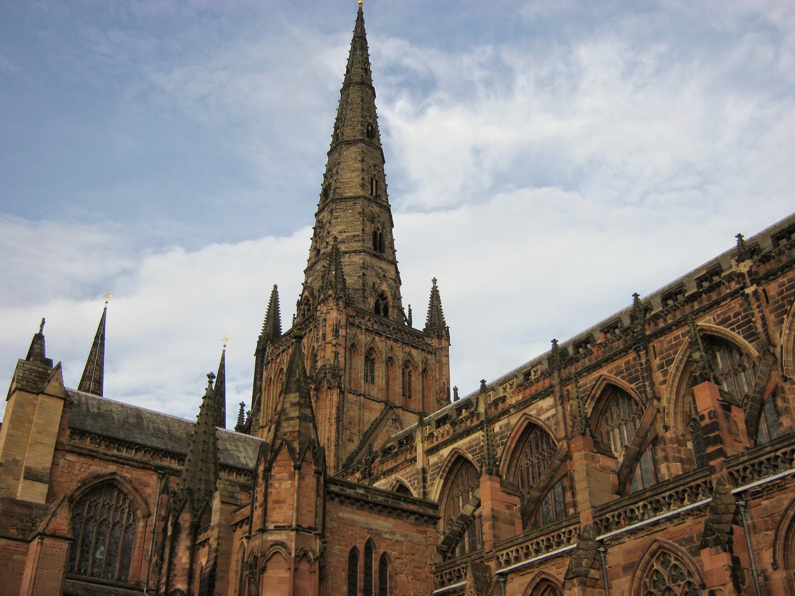

My first initial reaction to looking outside the cathedral was the sheer scale and majesty that it has as well as the medieval Gothic architecture that it possessed. The huge spires towered high above all of the other city's architecture like it was at the centre of everything. The colours of the stone were interesting as well with the reddish tints and back outlines over the smaller parts of the structure. At times it looked like it had a black outline around it like a graphic illustration. When I got up close I could see the years of weathering it had all over  as well as where it had been repaired and built up upon over the centuries. Just outside of the Cathedral I saw a tourist sign that said a great battle of an English Civil war happened here which ended up destroying one of the spires. It's amazing to thinks that this Cathedral was once the sight of a bloody battle long ago. It also mentioned that some of the statues and stone decorations were damaged by the soldiers there as they were sharpening their swords on them and their marks could still be seen on them to this day. It's quite amazing how much this building has been apart of history and still shows the marks that it left on it I present day.
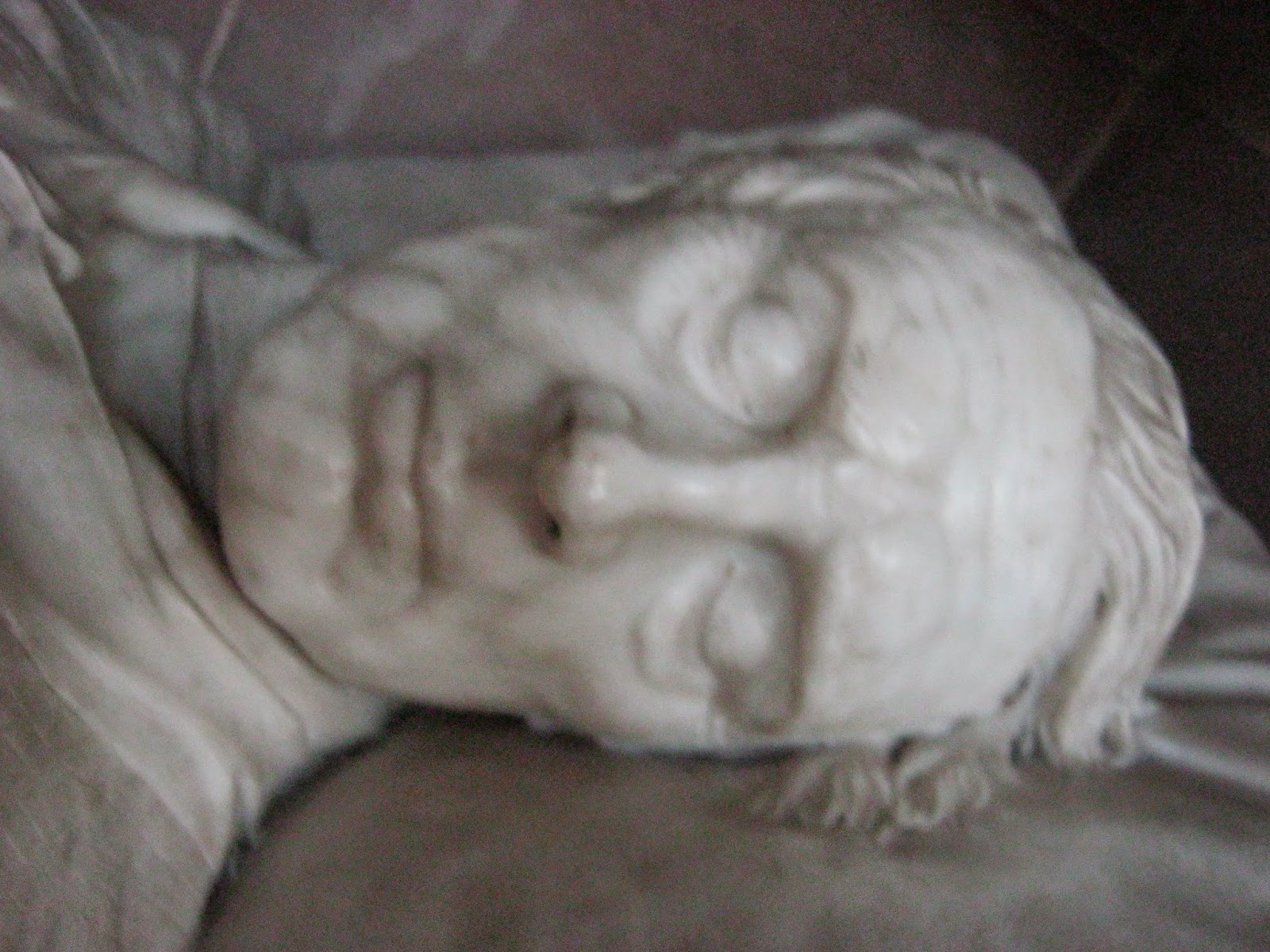

Once we went inside I got a deep feeling of calmness within me and felt somewhat at peace. The atmosphere was heavy within the building which was so quiet and cool in temperature. it made me really think about how people in the past had come here for sanctuary and peace so they could escape from the troubles of their lives. As I walked around the building I noticed that the corridors and arches were not in a straight line and were in fact uneven. This reminded me of the fact that this building was made by hand and not from machines and that blood, sweat, and tears went into constructing this place in tribute for God and not for the reasons we would a build a construction today, which today would probably be to either show off our wealth or power, or create space for work, shops, or any other conveniences that we highly demand this day. Its fascinating to see how much society has changed during the last several centuries back when this was built.
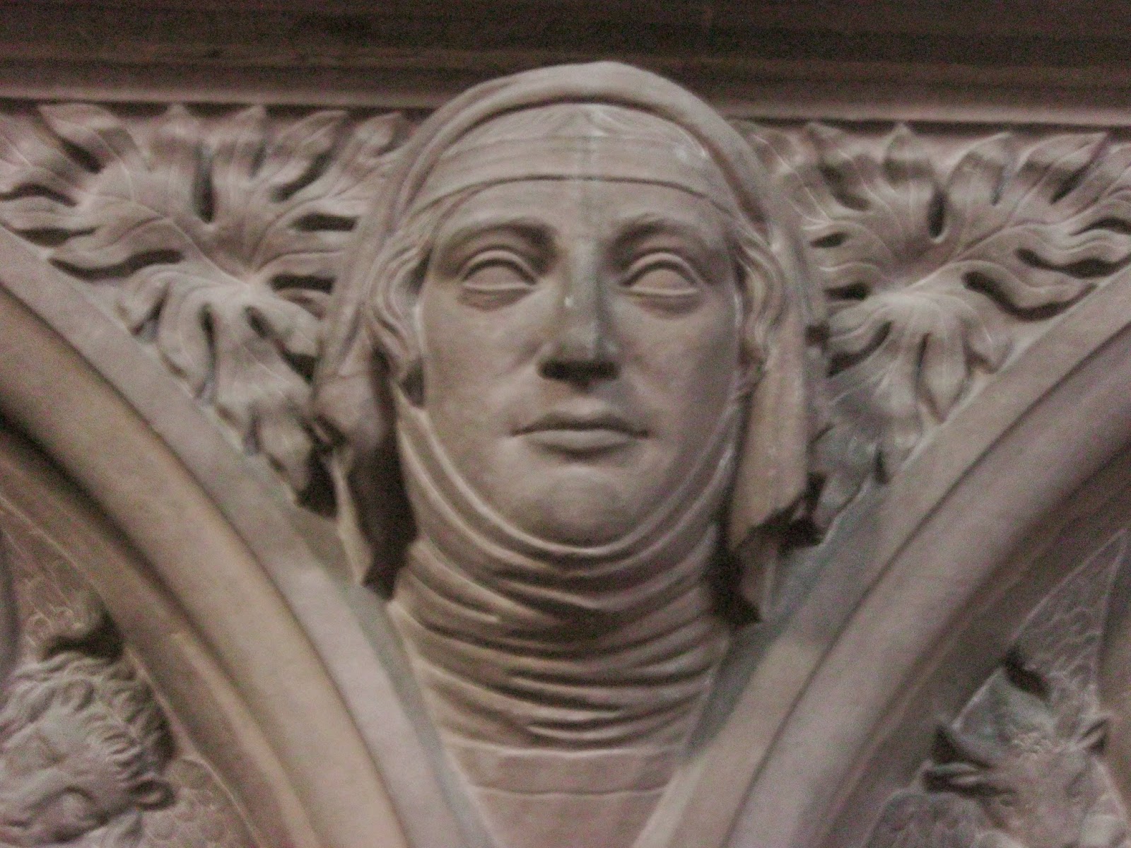

It occurred to me, while I was sketching a statue of a praying man, how much this building was completely saturated in the imagery of the Christian faith. I mean that might seem obvious because we are in a cathedral but literally everywhere you turn you could see tribute to the faith; on the ceiling, the floor, the paintings, the table cloths, the gold and stone decorations, the furniture, the windows, and even in the tiniest, most insignificant corners of the building you could see some kind of symbol for something mentioned in the bible. I find this funny because I remember reading about a 14th century painting that they uncovered that the people of the time covered because they feared that they would start to worship the imagery of God instead of the real God and, consequently commit blasphemy by worshipping a false idol. And now the Cathedral is covered in the imagery of the almighty. It's also incredibly ironic that the part of the painting that was supposed to depict god had weathered away by the time it had been uncovered.
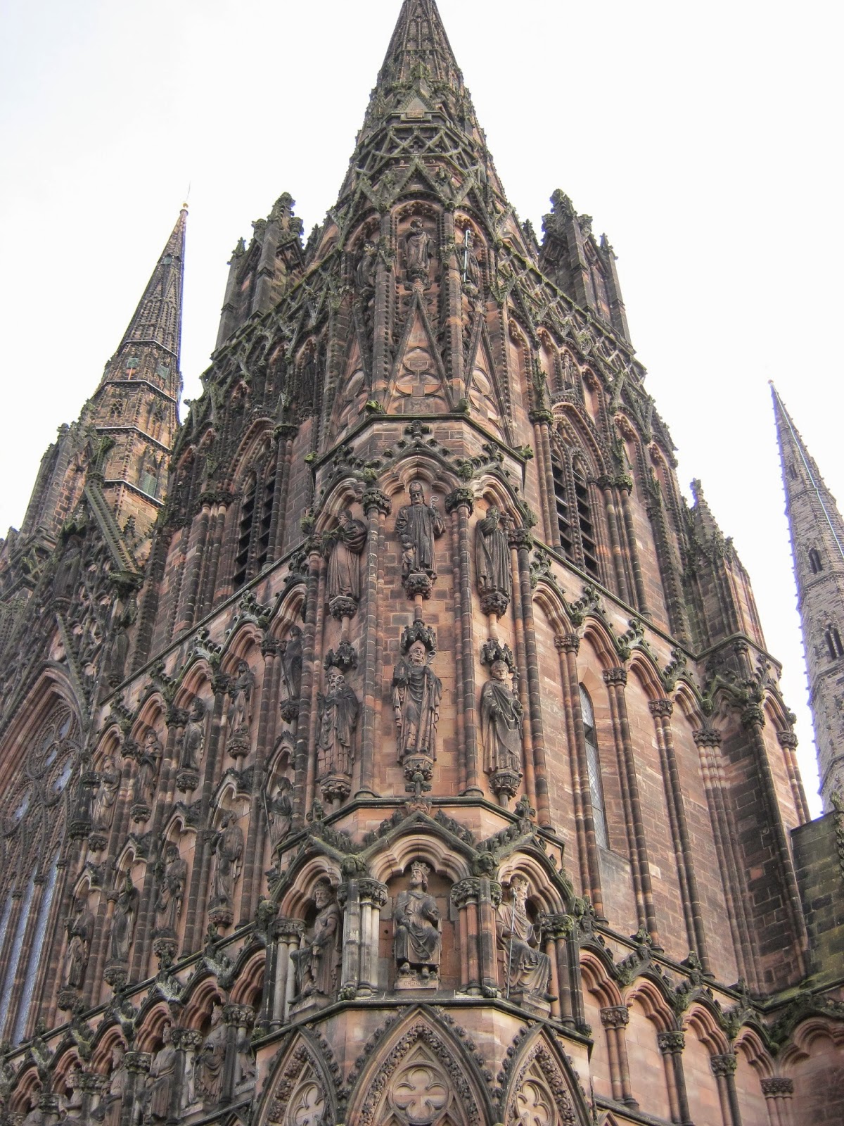

What struck me when I observed the graves that surrounded the Cathedral was one particular grave that stated that this was where the person who died met his end aiding the construction of the Cathedral and that this is where they buried him. That's when I looked up and saw over a dozen other graves surrounding the side of the building. I'll admit it when I first looked up at that image I shuddered a little bit, but then I looked down again and read that the grave stone had been donated and sculpted by his fellow workers as a tribute to his memory. I really didn't know what to think at the time as it stirred up a lot of questions in my mind; did this person volunteer, was he religious, did he have a family, how many others met the same fate, were all those graves the ones that worked on the Cathedral? Now I realise that this grave really sums up the human condition; the belief in something higher, wanting to pay tribute with a offering, self-sacrifice, and a sense of community between fellow man in the face of adversity. I really wish sometime in the future I could hope to achieve in capturing the feeling that I felt during that moment of realisation in whatever field of art I wish to pursue. Today had been more enlightening then I imagined it to be and I'm glad it was.


Monday, 29 September 2014

Perspective 2

In today's session we did some more perspective drawing involving a large display of various rectangles and cubes. I did my sketches in 4B pencil on white cartridge paper with the additional assistance of a ruler for accurate measurement. 


I did some initial sketching in my sketchbook for a warm up to get used to drawing perspective again. I think the problem with these sketches is that because I've had no horizon points and to some extents no horizons, I can't get the sketches to be as accurate as I desire but I want to achieve realism in my picture today rather then accuracy which is not possible without distorting the image in some way just so its all measured out correctly. I wish I could use more space to get some measurements but that would have left a lot of undesirable negative space that would have annoyed me on a aesthetic level. I need to figure out a way to get the best of both worlds without too much compromise. Apart from that the sketches are fine for reference points and will help me to transition to a even bigger drawing.


At the end of the first session, I had completed some initial sketches that would eventually evolve into more confident line drawings. The sketches are at first light and sketchy and have uncompleted objects. This was a good start for me since I can afford to make mistakes and improve on proportions and measurements when necessary. However the criss-cross of lines can often confuse me and I sometimes I forget which lines go in front of the other. Another criticism of this initial sketching is the infuriating amount of work I got to put into finding the angles and making sure that the faces of the rectangles look all right without any fit means of measurement expect my pencil and my eye


Here is a more finalised and refined version of the previous sketch work with hardened lines and even more objects. Although it isn't complete I still deem this sketch to be a success in practising the art of perspective drawing. I really like the nice straight edges of this sketch and the precise realism we get as a result from the accuracy in measurement. I do have some problems with this piece like the fact that some of lines go over each other because of  my short sight in the long run (you can see it on the chair legs) and the lack of sense of depth that you would get in other pieces whether measurement or tonal. If I was to go back on this piece and finish it off I would start off by drawing my final lines a bit softer and only hardening them up where an object is in front of each other so it adds a little more depth to the piece, and also have better foresight with adding my final lines so I don't have incidents where multiple irregular lines cross over each other and distort the perspective.


Friday, 26 September 2014

Evaluation of Micro-Macro


I got the wooden texture of the boxes fro photo-copying the cubes in a large size so I could see all the little details in texture then applied those textures to the piece so I could share those interesting little details with the viewer. The interesting thing about my composition of the boxes is that although they appear to be in a pattern, the one at the far-right is actually uneven. The reason I did this is so it fools you initially that this is a plain simplistic tonal study of some cubes but actually upon closer look, there is a lot more to them then just that and they actually have some individuality between them.


Overall I feel that this particular piece of work has gone very well and I deem it to be a success in my experimentation with tonal simplicity and subtle detail. what I really like about this piece is the three tone structure that is portrayed throughout the piece which demonstrates my knowledge of tonal differentiation perfectly. What I also like about the piece is the use of detail that invites the viewer to explore and discover the hidden layers within the sketch but not being so obvious that it distracts them from the emphasised simplistic tone of the piece and the more subtle tone use around the edges. The wash in the background worked perfectly for this tonal piece because it was a nice cool colour of blue that didn't distract too much but was dark enough to be able to add lighter shades on top and create contrast between the two tones within the drawing. If I could think of an improvement on the piece it would be the black background in the negative space since its a bit too improvised for my liking and could be developed more into a more appropriate and effective in depicting the negative space around the object.


If was to do this again, I would try to add some more colour to the shapes and get them to match their original object. I would still do it as a wash but there would be different streaks of colour this time to make the cubes stand out more as individuals. I would also try a different material, maybe pencil next time around like my original sketch designs. The reason why is because pencil is more precise then charcoal so it would be easier to direct the tone better and add in even more detail in the texture of the cubes

Monday, 22 September 2014

Perspective

In today's session we did some perspective drawing sketches that involved reference to a sheet, for assistance, given out and a large box installation to practice drawing from by our tutor. I have learnt a lot about perspective in this lesson and have practice three point perspective for the first time.


This first sketch was a demonstration of my understanding of a two point perspective and tonal perspective. The square was constructed from the two vanishing points positioned on the horizon line. where the lines cross create a 3-dimensional shape in a 3D plain. The shadows were determined by the position of the lighting and where the vanishing points cross. Although I have already done two-point perspective, it was a nice refresher to become familiar with the technique again and to be reminded of its usefulness in terms of sketching realistically and accurately.


The second sketch was a brief introduction to the concept of three-point perspective drawing. This involved a horizon line and a third vanishing point at the bottom to create a upside-down triangle. What I like about this technique is the results that I get from this technique, it really makes the drawing look dramatic and huge like its a huge skyline somewhere. However this technique is quite tedious to draw because of the number of lines you have to draw to get accuracy, and its hard to go back any mistakes since all the lines are drawn lightly and any attempt to rub them out will just ruin the other lines, but overall I do like this technique and I will use it in the future.


The third sketch was applying those techniques to a real sketch of an object to get a real sense of accuracy from the drawing with more ease then just trying to estimate positions, perspectives, and measurements by yourself. It was quite interesting to use this technique on a live subject matter as I had to compensate with the vanishing points and squash the image down to fit into the page. Although inaccurate it did pull off a nice effect that is akin to towering skyscrapers which makes me think of how this technique would be useful for drawing buildings and cities. I would however like to improve on my perspective inaccuracies by maybe drawing the vanishing points out of the paper to get a richer sense of accuracy and scale so in future they don't look so gigantic. 

Friday, 19 September 2014

Composition

In today's session, we finalised a concept for a large scale drawing which was bigger than any of the other drawings we have done in the past. I chose to do a long line of the cubes that I was drawing before but in a bigger scale and on washed white paper instead of brown paper.


The first step for my big drawing was to create a wash for a background so that I could easily define lighter tones and to make it stand out from the rest. I chose the colour blue because I think it complements the tones in my piece and the fact its dark enough to differentiate light from medium tones but also light enough to also differentiate darker tones in the piece. The next step was to create some straight line outlines in pencil and charcoal sticks. I really like the precision of my lines in this piece, so much in fact that I think I'll incorporate them into the final outcome of the piece.


The next was to lay out the initial tones of the piece to establish the grounds which it will be built up on and to add layers to the piece. I feel the the overall look of the cubes is really interesting and I can't wait to build on it more. In an attempt to make the image pop I added a black outline around the sketch in charcoal to make the lighter tones pop out to the viewer. I think the outline adds a nice 3D effect and compliments the piece perfectly. I hope to add details and texture to the piece as it develops to make it look interesting up close. The idea behind this piece is to explore the almost simplistic tones of geometrical shapes and to try to make them more detailed but not to use loose that simplistic edge to them which I hope to achieve with the further detail I will add in the future.


Sunday, 14 September 2014

Idea Development

In today's session we did some sketches on a large piece of brown paper so we can come to some final conclusion and end up with a more refined piece. Today I learned all about some new techniques and materials that I could use in drawing that I practised with.


Here is one of the first images I produced, It's a sketch of my object in a line drawing style, with a chalk outline. The inks are my own while the chalk is from the school.The reason I wanted to try this because I wanted to improve illustrative skills while also practising my sketching. What I like about this sketch is the added detail in texture that I got thanks to being able to put lines anywhere I wanted to put them on the image. What I feel I could improve is my accuracy with the lines and to straighten them out a bit. Maybe the use of a ruler will aid me in these endeavours.


This image was intended to try out some more unconventional materials, this case being inks and water, whilst also trying a more minimalistic style to just try out and see if it works. If I was to improve it I would try to master my brush-strokes better and to try it on a flat surface so the ink doesn't run as much. Although I do like some of the textural results from painting the inks so I'll try it another time just to see the results.


This image was a brief study of three-toned nature of the squares and grid based drawing. As a study it works but not really something I would call final piece material so at the moment its only good for a reference point for all further sketches.


This image was actually my first sketch but I've actually changed and added to it near the end of the session. It is a combination of pencil, charcoal, chalk, and inks to create a unique image. This is the image I intend to blow up for my big sketch next Friday. The composition is going to be a long line of twisted squares in a repetitive pattern. I really like this image because of its simple premise and execution with the two-toned style and the sharp shadows to contrast with some of the lightness of the image. In fact I explored the two tone style below to illustrate its effectiveness. What's great is that you can produce great results in little time without too much challenge but still have the time to put in a lot of detail to make all the squares unique. However I do have a bit of a problem with how the left cube looks and I can see the shortcomings from this technique when I look at it such as the wish-washy mid tones and some lack of definition in some parts but these can be easily overcome if i just try to stick to my strategy of separating the two tones with two tonal looks (light=white, dark=black). Overall I have learnt a lot about my referred drawing style and what materials I feel comfortable with.


Friday, 12 September 2014

Measurement

Today we did some drawing exercises based upon the techniques of measurement. We had to try, master, and demonstrate these techniques through sketches of this large installation below.
The way in which we sketched this installation was by sticking the A3 white paper onto a board then standing it on an easel that was tilted slightly so we could see the installation better. I liked this technique as it allowed me to compare and contrast my sketches easily and it didn't take as long to look at the subject and draw unlike say drawing on a table. However getting used to the angle of the board was a bit of a nuisance but otherwise i think I would like to use this technique in the future.

The first technique that we learn't about was the grid method which involves comparing the placement of objects with your pencil or brush and creating a grid based upon your observations to help to accurately position different subjects within your image with not much fuss. I found this technique to be quite helpful especially in my second sketch because it was quite hard to place objects in their spaces before. However, the technique depends upon your perception which can be inaccurate, which was a problem in my second sketch because I kept having to change the positions of objects in my sketches to try to get them to be more accurate which took quite a lot of my time.

The second technique we learned about was the sight size technique which allows you to make you sketches more accurate in scale by using your thumb or pencil to measure objects to compare to other objects to get a real sense of scale within your image. This was quite useful for me in my first sketch because it allowed me to get a quick sense of scale of the tyres which were all a similar size allowing me to shorten my time spent on trying to accurately draw each individual tyre. However, if a subject cannot be compared in size to another object it can really throw you off like in my first image where I messed up on trying to represent an odd shape that didn't match up to the scale I created and thus the rest of the sketch looked wrong because I could no longer draw it to scale.

Overall, despite some setbacks, I believe that the techniques I've learned helped me to sketch much more accurately and improved on my overall quality of sketching. I will be using these techniques in the future to further improve my sketching and drawing abilities.