Monday, 5 January 2015

Life Drawing 4

In today's session we completed more life drawings but instead of a typical style we went for more experimental drawings to train our skills and experiment to see the results. For example we started with trying to draw the figure with our non-dominant hand (in my case my left hand) to see what results it would produce. What I find interesting about the results of this experiment is how the line work looks as its got this unique delicacy and shakiness without looking too rough. The proportions and detail are a bit shaky but I don't think you can expect too much from a drawing made with my opposite hand and it still captures the general form so its got a unique feel to it.


These second drawings were drawn blindly as a lesson in trusting our spacial awareness skills on the paper and to get a greater feel of the figure of the body instead of just concentrating on the actual concrete forms which can lead to drawings that may look accurate but lack any visual flair or human emotion. As you can see there are a number of overlapping lines that illustrate the form of the figure but they lack focus and are oddly proportioned so they are not a reliable sketch that reflects my proportional skills but rather my pencil skills in capturing the feel of an object with all of its details. What I like about it is the unique look of the line work and how it outlines every crevice and feature of the body.


This third drawing was a experiment in continuous line without the blindness and is designed for us to see how good we are at representing the human figure without lifting the pencil off the canvas. It also teaches us about the importance of the idea that things don't need to be accurate to sell the idea of the human figure and instead we should focus on capturing the details and textures of the human body to really bring it to life. I like the progression of soft line towards more definite harder marks because it creates a sense of finality to the drawing and it creates depth in certain places on the body. However the proportions of the legs are a little too short so I should keep an eye on my proportions in the future.


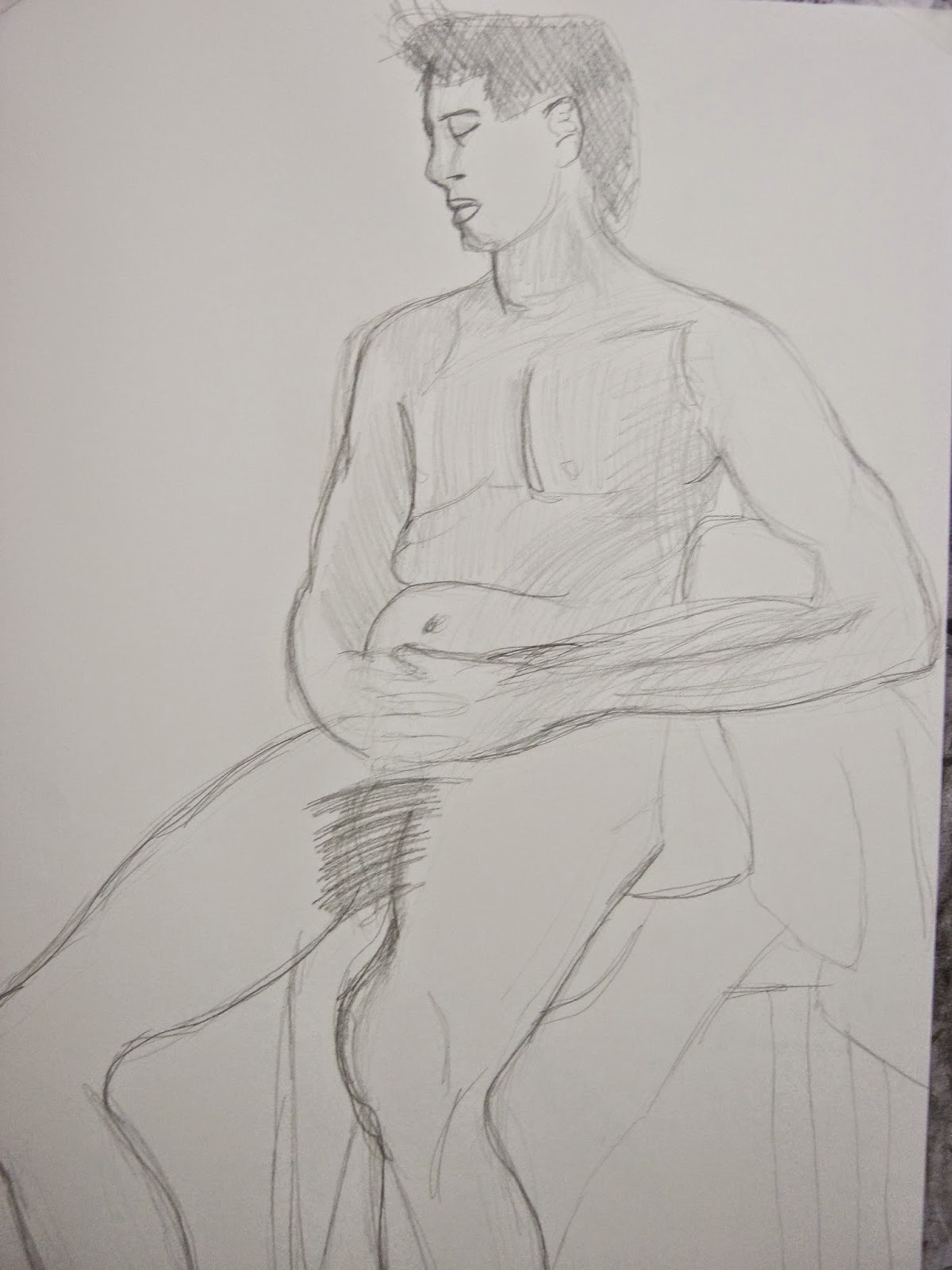
In this final sketch of today we concentrated on creating a sort of final conclusion to all the skills and lessons that we learn't from creating the prior experimental sketches by drawing a final human figure on a large scale within a longer period of time. I first started by drawing the initial outline in a a light pencil line and then slowly I started to make harder and harder marks to build up more definition and detail into the figure. I even added some detail in some light pencil tone to create minuscule details in the shading and to add a few more layers to the drawing. What I like about this drawing is the way in which I have captured the figure realistically with proportions that seem believable and even the face seems to look more realistic this time around.


Monday, 3 November 2014

Dry Point

In today's session we tried out the technique of dry point which entailed us to scratch onto a aluminium surface with a burin that acts like a pencil which acts as a plate for the ink print, and then rubbed with ink of any colour depending on the image in question with any excess rubbed off with it. Finally the plate and a piece of paper are fed into a press where the ink on the plate is compressed onto the paper where the print is made.


Here is my first scratched plate that was damaged in the top half by a unprepared press which I wasn't supposed to use so I had to cut it off making a press that is both incomplete and half the size. Besides my foolishness in trying printing without proper skills, the print that came from this plate was quite nice, although it was a bit bare and the shading didn't really work, but as a first try at the dry point medium the image that came out was not too bad. I would address the problems in this one with my next printing plate.


The next print I made was based upon the head of the key chain I used for the study. I added more shadow and cross-hatching this time to create better contrast and more dimensions through the added tone. I think the plate and print of this original drawing was quite good as it really captured the feel of the object more then the last one. However there is way too much negative space in the image that it becomes sort of distracting and I feel the cross-hatching could be worked on more.


Here is the final image of the day. It is a improved and edited plate from the last print except with better cross-hatching, a blacked out background and even a border around the image. I also chose to print this in red ink rather then black ink too make it more macabre and unique from the rest of the images. I think that this is my best print so far as it really captures the almost medieval tone of this type of printing as well as add a Gothic tone thanks to the red ink. I also think the block outline and darkened background work well for this image as it adds to the atmosphere of the print and the cross-hatching looks much more solid and professional. One gripe I have with it is that I didn't have a more complex subject to draw which I think would have challenged me more and added a little bit more to the final piece.

Tuesday, 21 October 2014

Composition and Tone

In today's session, we completed some exercises in composition and tone with the use of both pencil and pen plus water. We wanted to develop our skills from last session so that we are more prepared to develop more of our skills in creating compositions for a drawing and creating compelling tonal work through unique means.

In this first drawing I created, I explored the medium of pencil in straight-forward way instead of the past experimental ways so I could see if it was still of relevant use to me in the near future of my future drawing work. I believe it still is as it can create some really nice subtle tonal changes that can become more detailed if you put work into it and I found it comforting to use line again as a skill instead of discarding it because it may not produce the most realistic of results. However I still need to work on this technique if I wish to become significantly skilled with the craft and I think the areas that needs working on the most in my pencil drawings is the use of proportion and the my tonal consistency.

In this second drawing which was completed through the medium of pen and a water wash was an exercise in exploring the medium of ink as well as try to improve those skills since I did a ink and water drawing last fortnight. I think I did relatively well as I filled in the space quite well this time instead of just leaving it blank but I still need to practice more with this medium as by far its probably my weakest form of drawing. For example I still haven't managed to handle how the the ink and water spreads so I try and fail to clean up some mistakes that become painfully obvious if you look to closely at the drawing.

This last drawing was an attempt at a final conclusion of my previous drawings and a final go at the mastery of the technique using pen and ink wash to create unique tones. I also used drawing ink to darken the more darker tones within my image, and a lot more contrast and dynamism that was lost in the last image I drew. Overall I believe I have made some good developments in my skills with drawing with inks and water but I still need more practice to become better at it. I really like how the drawing ink I painted added much needed contrast and darkness that was absent from the rest of my ink drawings and how well it blended in with the rest. However the rest of my tonal work can be quite muddy and some tones look too similiar to each other that you can't get the perspective from the image correctly.


Saturday, 18 October 2014

Final Lichfield Composition

In today's session we completed a final composition based upon our studies and photographs of the Lichfield Cathedral based upon our previous experiments we did last session. I decided to draw the statue head that I drew last session but on a bigger scale with a blue wash and drawn in chalk. I chose the medium of chalk because of its natural graininess and its way to create smooth transitional tones, and the fact that chalk is a type of mineral so it relates quite well to the texture of stone.


The first step I undertook was the wash for the background that I created by mixing black and turquoise ink with a little bit of water to thin and then applied it with a thick brush. I chose the turquoise colour because the original statue had a blue hint to it's colour and I thought it would be better to add a ground then just leaving the paper blank white and uninteresting. I think the backwash works well for the first part of my drawing work and adds a nice blue tint underneath the white chalk. Although I will add another darker wash around the finished image s that it pops out more and doesn't blend as much into the light blue background.


Here is my start at colouring in my initial sketches in pencil with the medium of chalk and the detailing of the statues collar. I really like how my chalk drawing is coming along as I have managed to capture how the light catches the stone and the graininess of the chalk adds to the texture of the image as well as create a few inconsistencies in the shadowing that you would in most stone ornaments. I also like the tone that I have created with the chalk like on the folds of the clothing which look visually appealing and the slight highlights on the nose and the brows help to show how the light hits and shines off of the stone statues head.


Here is the final image with the completed chalk drawing and the new wash around the statues head. Overall, This particular project is probably the best drawing that I have done for the drawing sessions so far. I think its because of the medium I chose for the drawing was perfect for the image and my skill with said medium was quite high when I completed this drawing. I also think it was because that the subject that I was drawing was something that I was actually interested in, the anatomy of stone statues, so it kept me focused and motivated to draw the actual object with a high level of enthusiasm and the because I wasn't trying to be too experimental with my materials that it was completely untread territory like my other experiments that weren't nearly as successful.

Drawing Techniques

In today's session we tried out a new technique of sketching that was inspired by the artist Georges Seurat. The technique involved holding out our pencils at about arms length, whilst holding our pencil like a dart and then starting at the centre of the image make small figure of 8 motions with the pencil and adjust the pressure to adjust the tonal aspects of the image. This was a strange technique to get used to because it involved going against the notion of creating an outline before adding the tone and instead create the shapes or form just with the tone. It was a bit tricky to get used to at first but overtime I adapted to the new way of thinking and got used to the little motions that I had to make, although it did hurt my arm after a while.


The first image I drew was just in plain pencil with a little bit of compositional awareness in mind and was used to help me get used to this new technique. I really like the unique look of this piece as the tone is gradually built up from the pencil marks and this new idea of creating a image without the aid of line really opened up to me as a area of exploration after doing this particular piece. However, although I tried to keep the best compositional ideas in mind as I was creating this, I had failed to make a compelling composition out of the image because of the fact the image was improvised from the centre of the page I had no idea how the final image looked and it unfortunately lacked any of the compositional ideas and techniques that I learned last lesson. 


This was the second image of the explorational stage of this new technique but I decided instead of using pencil this time around, I instead used fine-liner and the reincorporation of line to explore the full potential of this new technique. I even added water to the piece to incorporate more tone into the piece and create a shadow like effect. I like the composition of this image a lot better then the first one because it incorporates a lot more elements/ objects into it and there isn't so much negative space that it makes the image look small and unfocused. However, my foreshortening technique isn't up to par in this image as I have flattened the brush so it looks like its standing up when it actually is lying down. Also I don't like how the bristles of the brush turned out and I wish I didn't add water to it because it looks messy and unlike real bristles that you would find on a brush.

Friday, 10 October 2014

Lichfield Aftermath

Today we followed up on the previous sketches and photos we took in Lichfield with a series of sketches and small productions that we used to explore different themes. We also tried different materials from the ones we used before so that we could explore the full drawing spectrum with inspiration from the artists that I have listed.


This first image was copy of one one of my photos of one of the corners of the cathedral printed on A3 drawing paper, and I decided to experiment with the tonal aspects of the image by using white chalk for the highlights and ink cross-hatching for the darker areas. What I really like about this experiment is the use of the chalk for highlights as really adds some much needed contrast to the image and overall makes it more visually appealing. However at times the cross-hatching isn't up to par and to be honest there isn't much recognisable difference in the image expect for the darker lines in some places.


The second image was taken from a memorial stone within the church and was sketched with pencil initially and then filled in with oil pastels to give colour and tone. What I like about this image is its general atmosphere of mystery and, in a way, magic because of the wispy dream like swirls of smoke and the almost Arabic design of the gauntlet within the image. However the tonal aspect of the image is leaves much to be desired and overall needs a total revamp or a change in sketching material.


This is the start of a large A2 experiment in tone and and line that first started out as a large sketch of a spire of the cathedral which was then covered in shavings of graphite and rubbed in, then was given a watered down acrylic wash over the tonal areas and finally partially drawn lines of the details within the structure drawn in fine-liner. I believe this to be the least successful of my experiments and that was partially the reason a gave up on it. It looked good as a large sketch and then a tonal study in graphite but when I added the wash it blended the tones together, losing the darker striking tones and making it look like a giant graphite smudge, and then the lines didn't help either by making the structure seem flat and less imposing as it was. If I could go back in time I would have forgotten the wash and the fine-liner and instead have focused on the tonal aspects to create line and contrast instead of the amateurish harsh lines of a pen.


This image was done in the last few minutes of the lesson and was when I stopped working on the third image. It is a pencil sketch of a stone sculpture's face on green recycled paper. If I was to work on this more I would begin to add tone and rub out my previous lines to create a tonal study of this sculptures face and maybe even add a bit of white chalk to emphasise highlights on the lighter parts of the face when necessary.

Tuesday, 7 October 2014

Composition

In today's session we did some exploration of the idea of composition and the placement of items in a image. I used a viewfinder to select an area to draw and then I drew an outline of the subjects within the piece and only cross-hatched the areas of negative space. What I found interesting while doing this exercise is how much a image is made up of negative space and how useful it is at defining the forms of subjects within a piece. What I also found interesting about this exercise was that the positive space did not take up such a huge area that I thought it would and only covered about half the page which means that within this chosen are of interest there is just as much amount of empty space within this sketch then the actual drawing itself.


As a finally to the lesson we did a final sketch of a chosen area in fine-liner and a water wash. This wash combined with the ink pen created tone and smoothed it out evenly across the page. What I like about this sketch is how the ink spreads across the page when water is applied but yet the original lines where the tone was still stay there even though they have been washed over so it still had that graphic novel like look to it even though there was still tone. The thing I don't like about the sketch is my line work because I draw way to rough and because of this looks way to sketchy and amateurish to be considered a decent piece of work. If I got the chance I would try it again and choose a more interesting subject to draw unlike this uninteresting iron and box so that I can add more detail and overall create a improved final piece.